

Web · Guide · · 4 min read
A modern CSS reset for cleaner web typography
Which new CSS properties genuinely improve text on a website and which are better skipped for now: line wrapping, hyphenation, type sizing and fonts.


CSS can now handle typographic details that used to need scripts or manual tweaking. Think of a lone word at the end of a paragraph, an awkwardly broken heading, or an oversized heading in a narrow column. CSS-Tricks has published a collection of such rules called tidy-typography.css. Here I explain which parts are useful for an ordinary site, such as a conference website, a portfolio or a small business page, and which are better skipped for now.
What goes into a modern reset
A classic reset evens out browser default styles. A typography reset goes further and sets sensible defaults for line wrapping, hyphenation, type size and the font’s own features.
You can take the whole file or pick only the rule that fixes your specific problem. Browsers simply ignore rules they don’t support. That only helps you if the page still looks decent without them.
Line wrapping without JavaScript
According to MDN, text-wrap-style (shorthand text-wrap) has worked in current browsers since October 2024. Three values are useful:
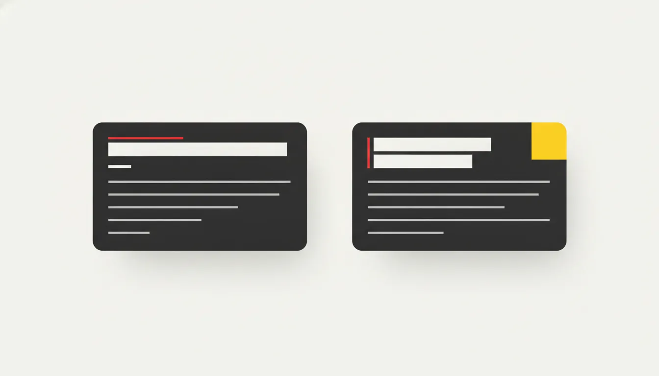 Left: default wrapping with a stranded word. Right: a balanced heading and a paragraph without a short last line. · Illustration: AI-generated
balancefor headings, quotes and captions. Text is spread evenly across lines, so a heading doesn’t end with one short word. It only applies to short blocks (up to six lines in Chromium, ten in Firefox), so the performance cost is negligible.prettyfor paragraphs. It prevents the last word from sitting alone on a line, but the algorithm is slower, so use it for body text only.stablefor content users edit, so the paragraph doesn’t reshuffle with every new word.
It is worth limiting paragraph width to about 65 characters (max-width: 65ch). One CSS-Tricks reader suggests putting the limit on the whole list rather than on individual items, so items don’t stick out.
Hyphenation needs the right language
hyphens: auto lets the browser break words at the end of a line. It has been widely supported since September 2023. It only works if the document has a correct language attribute (for Croatian, <html lang="hr">) and the browser has a dictionary for that language.
Extra properties such as hyphenate-limit-chars and hyphenate-limit-lines prevent tiny fragments and runs of hyphenated lines. Readers’ comments note that some of them currently work mostly in Safari.
Keep headings and code on hyphens: manual. A hyphenated heading looks like a mistake, and broken code can change meaning. You can mark a break point by hand with a soft hyphen, ­.
Type size based on the column
Fluid type calculated from the screen width (vw) doesn’t know how wide the element itself is. That is why a heading in a sidebar grows as if it filled the whole screen.
The fix is to make the wrapper a container (container-type: inline-size) and use the cqi unit instead of vw inside clamp(). cqi is based on the container’s width, so the same heading adapts to both the article and a narrow column.
Fonts without fake bold
font-synthesis: none stops the browser from faking bold or italic when the font lacks those styles. MDN explains why this matters: real italics and bold weights often have different letterforms.
Variable fonts keep all weights and widths in a single file. With them, font-optical-sizing: auto adjusts stroke thickness to the text size. For tables of figures, use font-variant-numeric: tabular-nums so digits line up in neat columns.
Where to be careful
The comments under the original article point out that this is a set of personal choices, not a neutral reset. Readers criticise, among other things, -webkit-font-smoothing, text-rendering: optimizeLegibility and forced kerning. They also criticise text-box-trim, which is poorly supported and can disturb the layout in browsers that don’t know it. Hanging punctuation currently works only in Safari.
In scientific texts, watch your subscripts and superscripts. If you enable font-variant-position while also using font-synthesis: none, a fallback font may not display subscripts and superscripts correctly.
Summary
- Use only the rules that solve a real problem.
- Use
balancefor headings, andprettyplus a width limit for paragraphs. - Automatic hyphenation only works with a correct
langattribute. - For headings in columns, use the
cqiunit instead ofvw. - Test experimental properties in several browsers before publishing.
Cover: AI-generated
Sources
- CSS-Tricks — Taming Typography: Building a Modern CSS Reset, 2026-11-05
- MDN Web Docs — text-wrap-style CSS property
- MDN Web Docs — hyphens - CSS
- MDN Web Docs — Variable fonts guide


